
Coors Light
Branding
Art Direction
Packaging
OVERVIEW
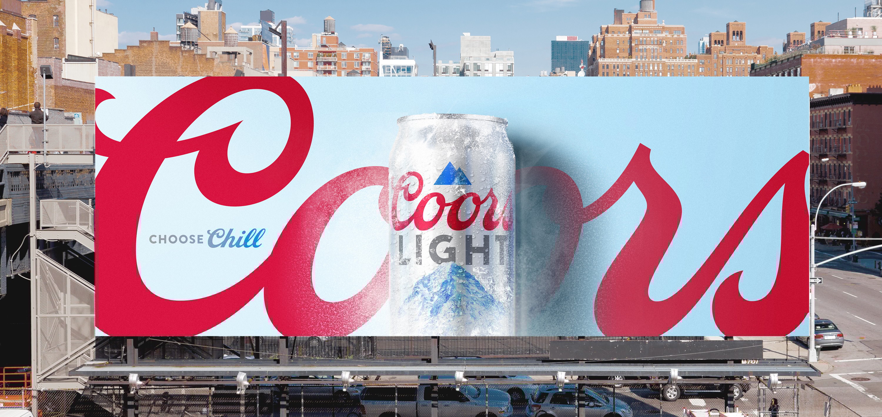
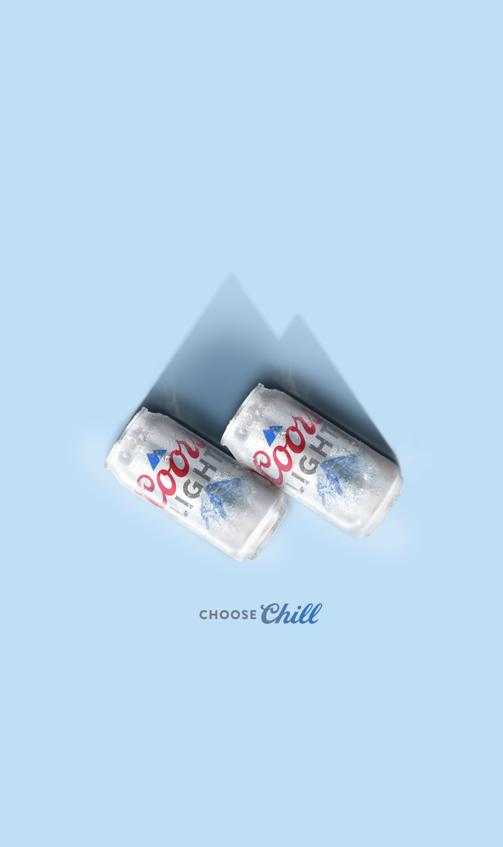
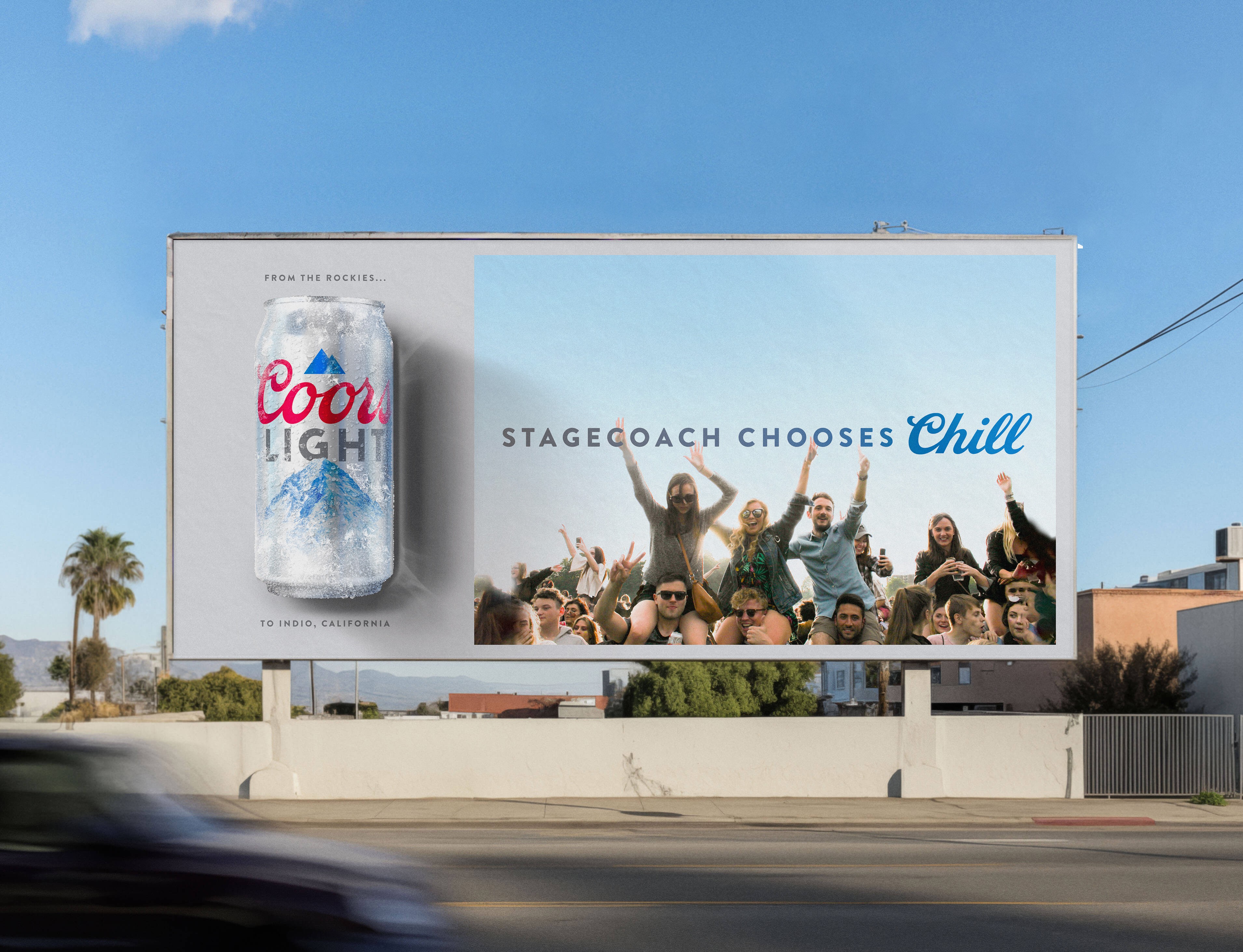
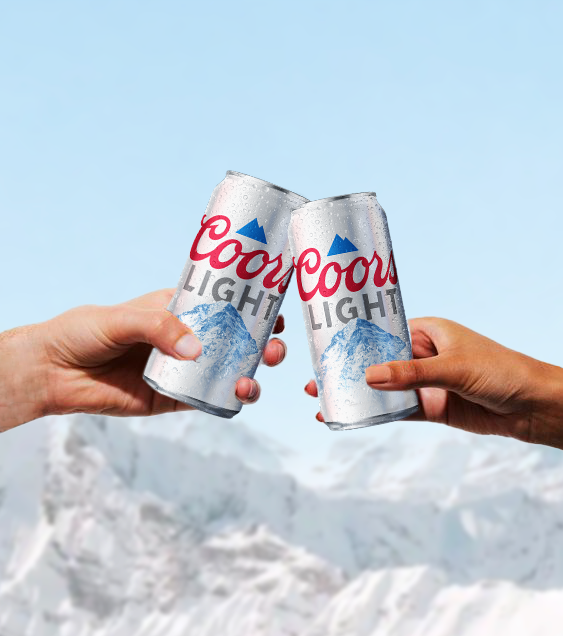
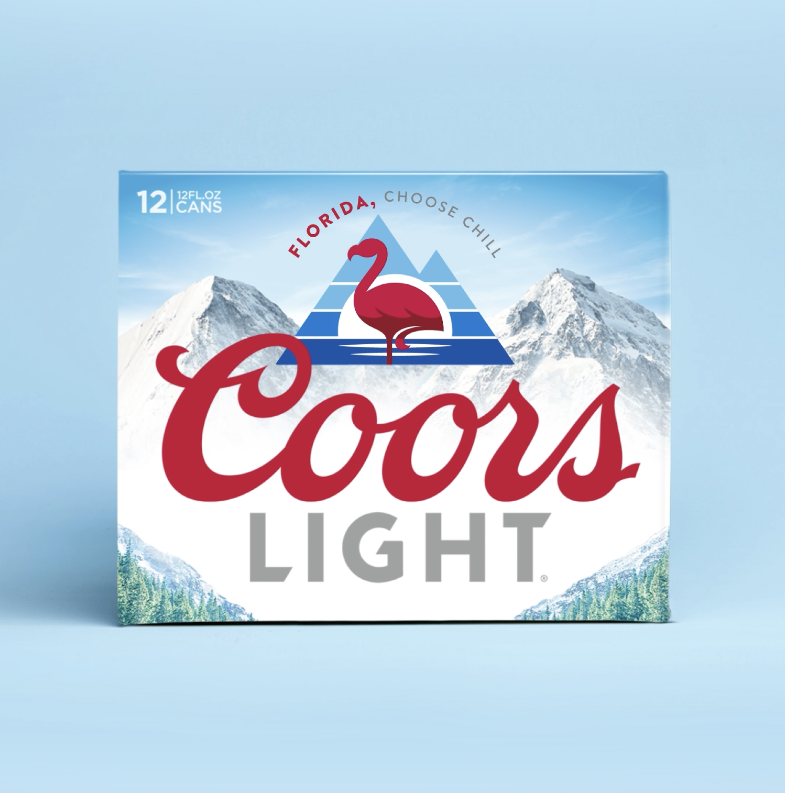
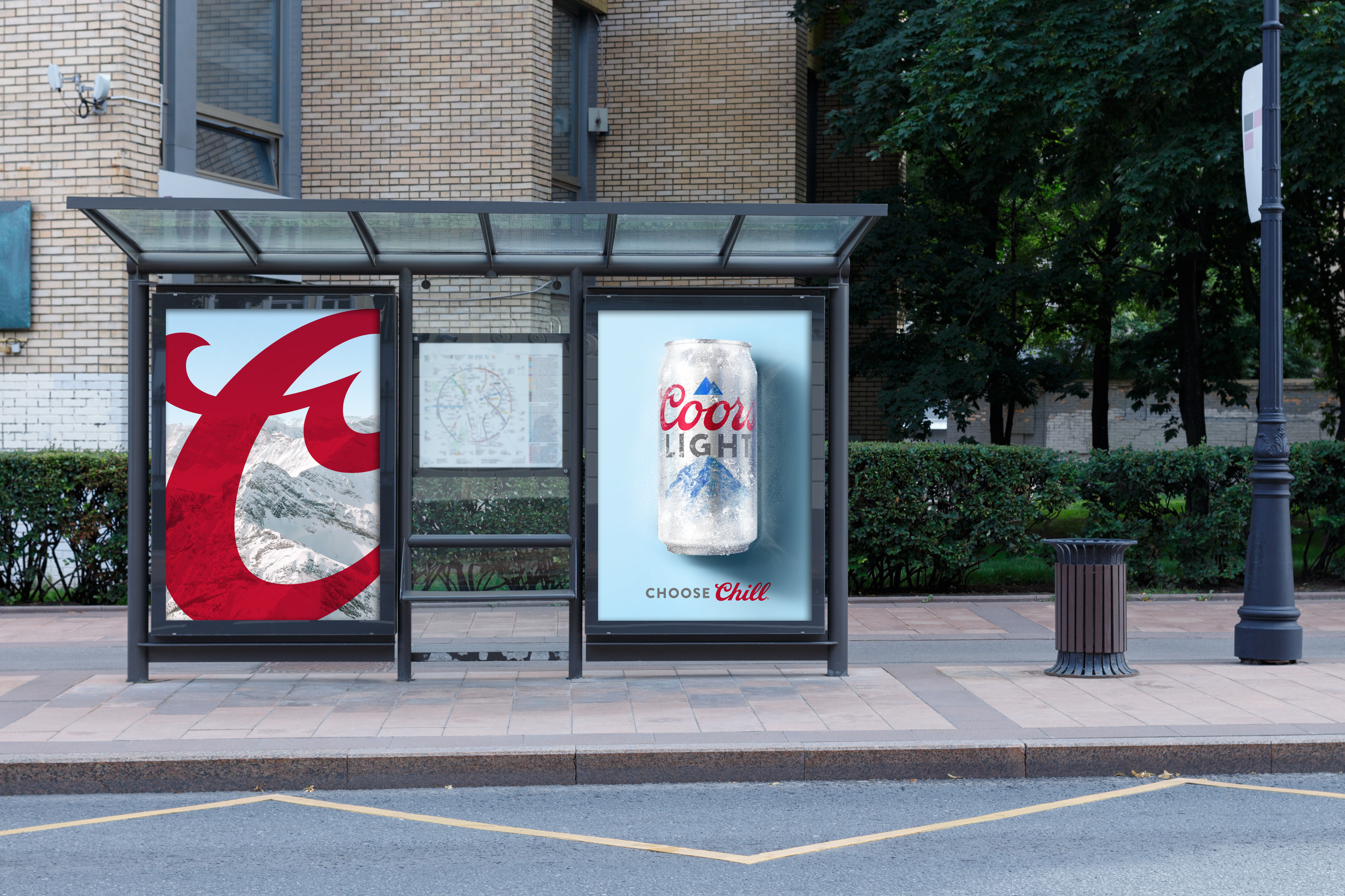
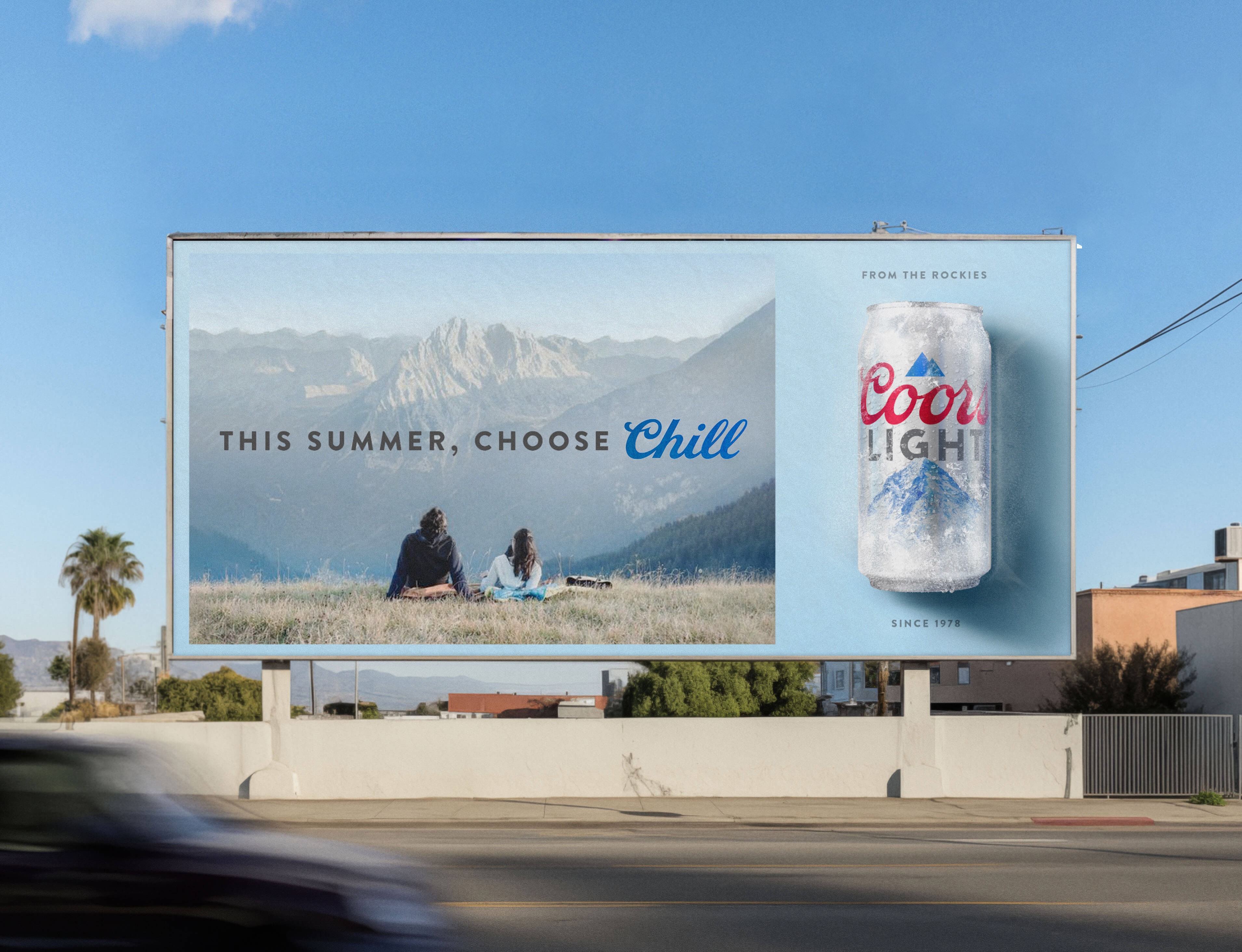
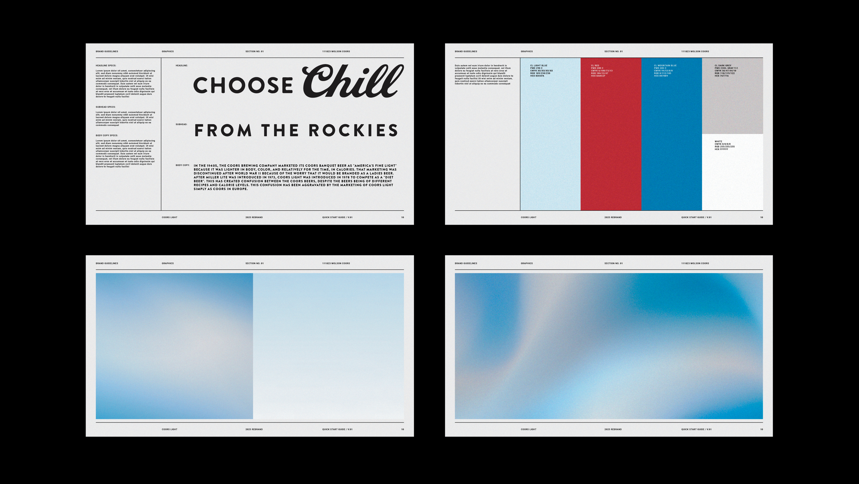
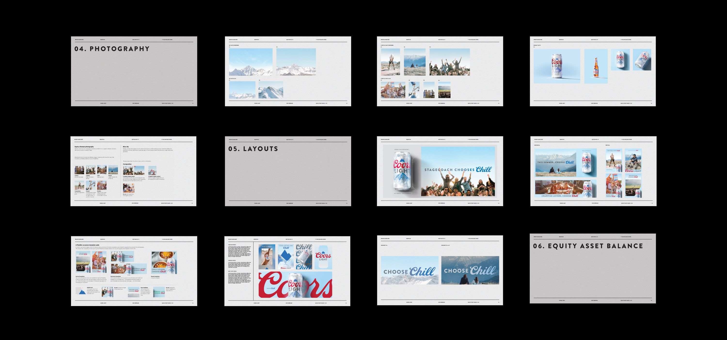
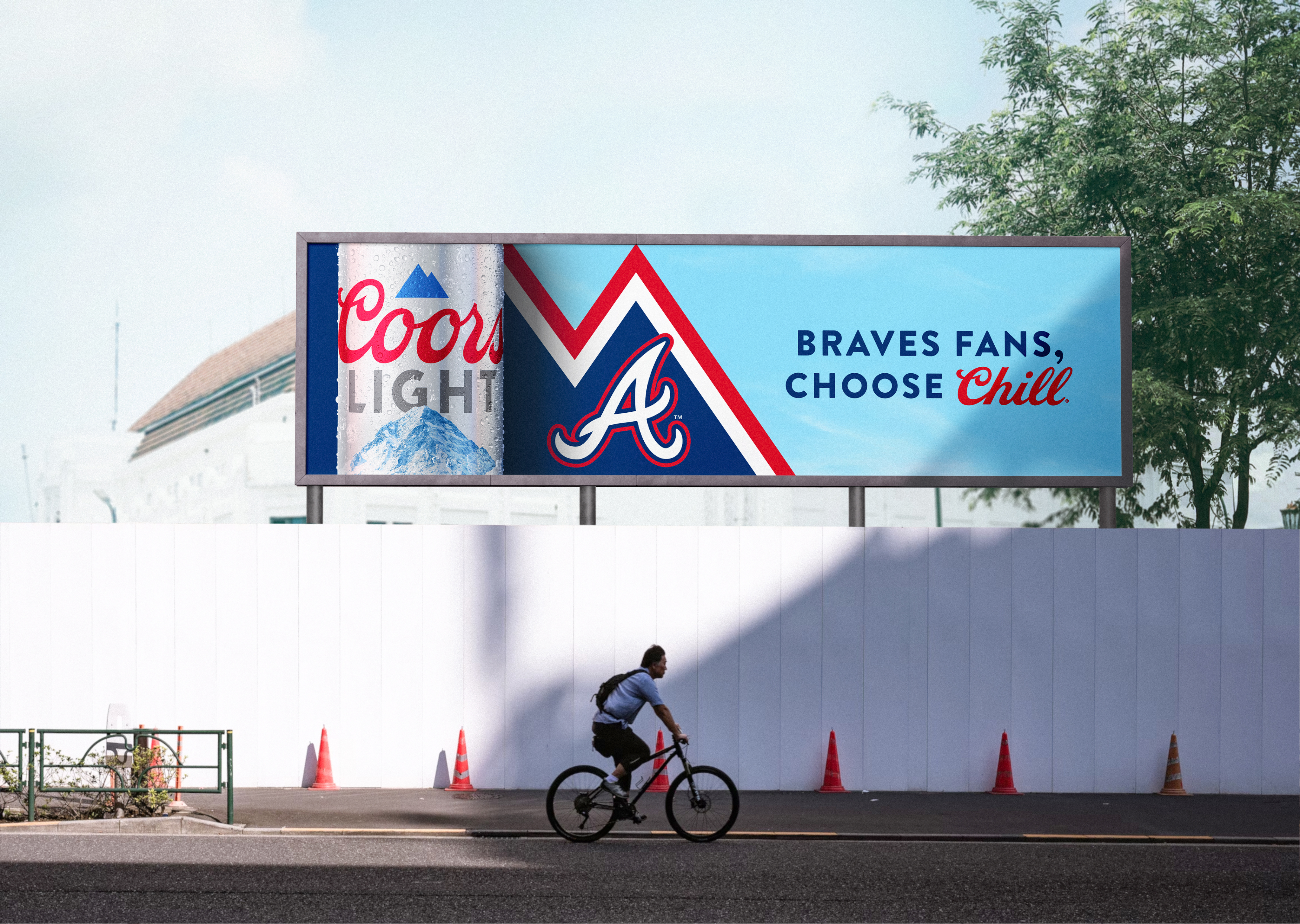
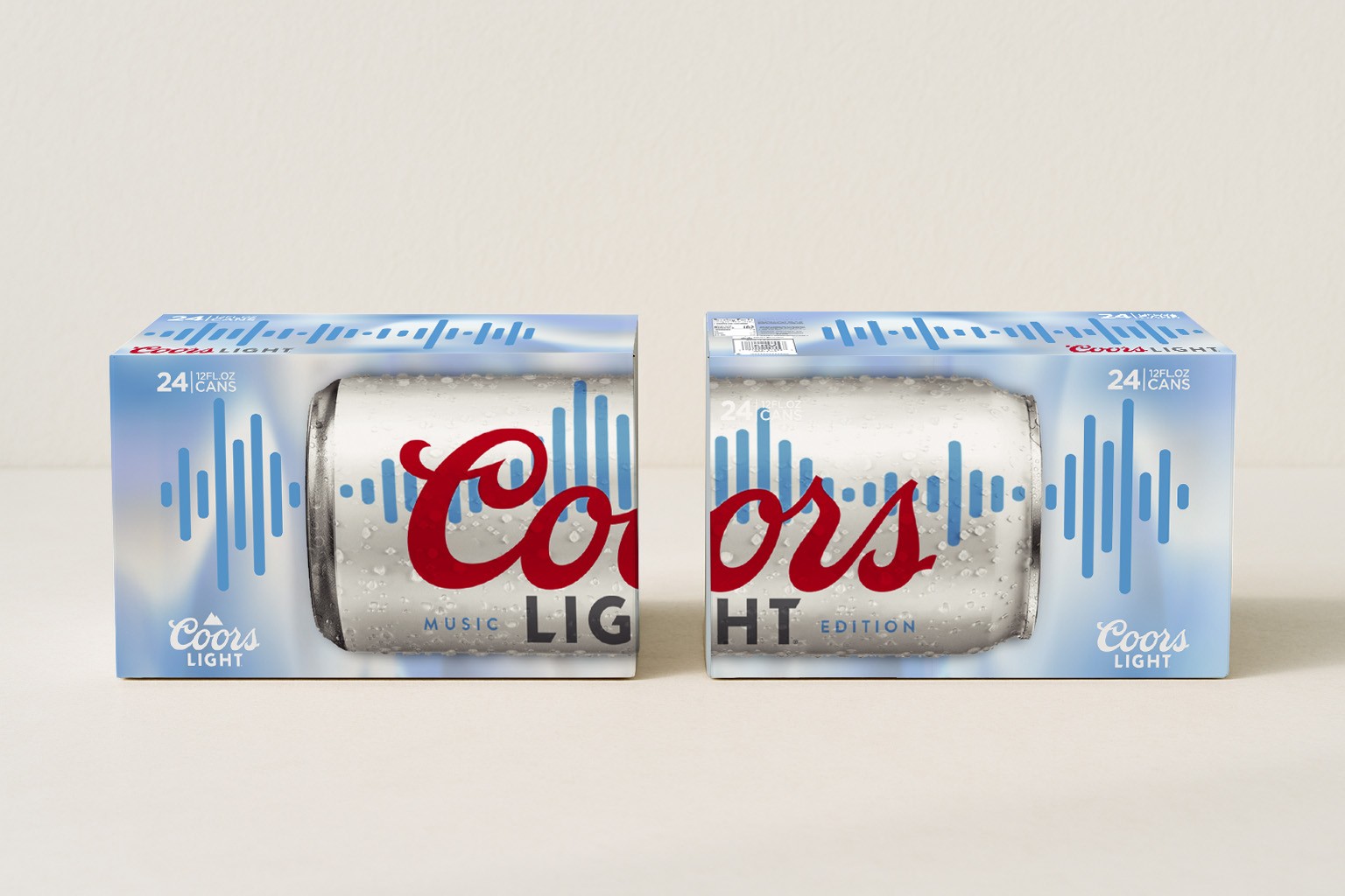
Coors Light wanted to evolve its identity to feel more modern, inclusive, and locally relevant while maintaining its iconic heritage. The work spanned a national localization campaign, seasonal packaging including a summer program, Out of Home applications, and photography direction as part of the broader equity refresh.
ROLE & STRATEGY
I helped guide the project from concept through rollout, proposing the use of the mountain icon as a holding shape to unify regional identity marks and reinforce the brand’s most recognizable asset. My contributions included packaging design across localized and seasonal SKUs, as well as art direction for Out of Home and photography, ensuring that new elements scaled clearly and consistently while striking a balance between heritage and a contemporary, inclusive feel.
AGENCY
Turner Duckworth
Creative Team
Executive Creative Director
Chris Garvey
Creative Direction
Jared Britten
Design Direction
Hannah Steinberg
Art Direction & Design
Keila RobertsKatie BargerMatthew Knight
Account Manager
Tristyn CooperTom Ashley
Illustrator
Jamie Nash

next project


Keila Roberts

(kay-luhhh)

she/her/hers

San Francisco, CA

hello@keilaroberts.com

303.828.6099

All Rights Reserved.
2025-2026

Work

Information
Coors Light
Branding
Art Direction
Packaging
OVERVIEW
Coors Light wanted to evolve its identity to feel more modern, inclusive, and locally relevant while maintaining its iconic heritage. The work spanned a national localization campaign, seasonal packaging including a summer program, Out of Home applications, and photography direction as part of the broader equity refresh.
ROLE & STRATEGY
I helped guide the project from concept through rollout, proposing the use of the mountain icon as a holding shape to unify regional identity marks and reinforce the brand’s most recognizable asset. My contributions included packaging design across localized and seasonal SKUs, as well as art direction for Out of Home and photography, ensuring that new elements scaled clearly and consistently while striking a balance between heritage and a contemporary, inclusive feel.
AGENCY
Turner Duckworth
CREATIVE TEAM
Executive Creative Director
Chris Garvey
Creative Direction
Jared Britten
Design Direction
Hannah Steinberg
Art Direction & Design
Keila RobertsKatie BargerMatthew Knight
Account Manager
Tristyn CooperTom Ashley
Illustrator
Jamie Nash
next project


Keila Roberts
(kay-luhhh)
she/her/hers
San Francisco, CA
hello@keilaroberts.com
303.828.6099
All Rights Reserved.
2025-2026

Work
Information
Coors Light
Branding
Art Direction
Packaging
OVERVIEW
Coors Light wanted to evolve its identity to feel more modern, inclusive, and locally relevant while maintaining its iconic heritage. The work spanned a national localization campaign, seasonal packaging including a summer program, Out of Home applications, and photography direction as part of the broader equity refresh.
ROLE & STRATEGY
I helped guide the project from concept through rollout, proposing the use of the mountain icon as a holding shape to unify regional identity marks and reinforce the brand’s most recognizable asset. My contributions included packaging design across localized and seasonal SKUs, as well as art direction for Out of Home and photography, ensuring that new elements scaled clearly and consistently while striking a balance between heritage and a contemporary, inclusive feel.
AGENCY
Turner Duckworth
CREATIVE TEAM
Executive Creative Director
Chris Garvey
Creative Director
Jared Britten
Design Director
Hannah Steinberg
Art Direction & Design
Keila RobertsKatie BargerMatthew Knight
Account Manager
Tristyn CooperTom Ashley
Illustrator
Jamie Nash
Account Manager
Tristyn Cooper
next project


Keila Roberts
(kay-luhhh)
she/her/hers
San Francisco, CA
hello@keilaroberts.com
303.828.6099
All Rights Reserved.
2025-2026